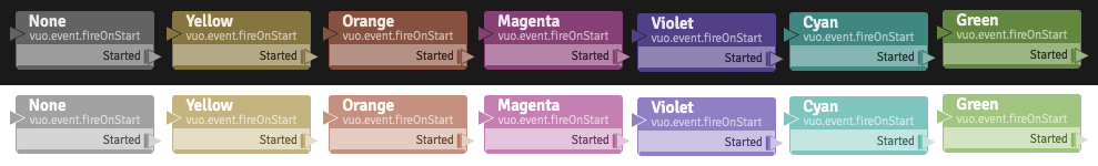
Something I suspect would be fairly simple to implement and I would really find helpful would be to have a few more options for color tinting the nodes. I’ve attached a super quick mockup (I didn’t have time to make them perfect) just to give you an idea of some of the options I was thinking about and a few changes to some of the existing colors. I’m only suggesting this because I’ve found a few instances when making complex composition where a few extra colors would help make organization better.
I was thinking a total of 10 visually different colours would probably be sufficient. I’m really hoping this is something simple enough that votes aren’t required because I’ve used them up on other requests. ;)
Hi, @cwilms-loyalist. Adding Tangerine, Blue, and Lime, and tweaking the saturation of the existing Yellow and Orange, should (as you said) be pretty quick and uncontroversial — I’ll tentatively schedule that for implementation.
Some other thoughts:
Adding Charcoal and White is an interesting idea — those tints emphasize/deemphasize a node (Light color scheme), or deemphasize/emphasize a node (Dark color scheme). I wonder whether it would be more consistent/semantically-meaningful to call those “Emphasize” and “Deemphasize” (or similar), and invert them depending on the Dark or Light color scheme is active. And be able to emphasize/deemphasize nodes of any tint (not just grey). Maybe we could pick a slightly-darker color for White so we don’t need to invert the text (yet still keep it distinguishable from No Tint).
I’m less convinced about Sunlight, since it inverts the text colors — that feels too out-of-place to me.
We’ll have to think more about whether to add Red — we’re already using red halos to indicate erroneous feedback loops, and we’re planning to also use red halos to indicate other node errors (file not found, etc). Having nodes tinted red might be unsettling. :^]
It would be handy to add color swatches to the Tint menu, especially if we’re adding more color options.
Feel free to respond to any; we’ll keep thinking about this for future work.
Those colors would be great additions and much appreciated!
I also really like your thought about Emphasize/Deemphasize; that would really help highlight important nodes in a composition. Even to use it as a construction tool, being able to de-emphasize nodes that you know to be working properly and highlighting nodes that you have identified as not working properly in your composition could be really helpful in mentally visualizing your project as you troubleshoot design issues. Great idea!
I agree with leaving out “Sunlight” I wasn’t sure about that one either. I also hadn’t thought about how a red halo was used to indicate feedback loops, so you are right that leaving that out as a color tint is a very good idea. As far as a proper use for red goes I wonder if using it to “flash” over a node each time an event is dropped would be helpful and maybe a solid red for when a file isn’t found or a connected file is unreadable.