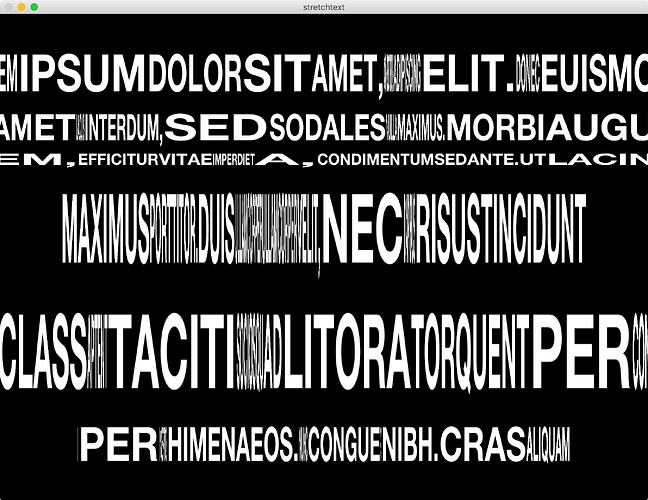
For those of you who don’t know Zach Lieberman, he’s a G, you should check out his instagram, you may like it ;)
Recently anyway he’s been playing with something that I think’s really interesting and was wondering if anyone had any thoughts about achieving an effect like this:
https://www.instagram.com/p/BgHSIeMgzjX/?hl=en&taken-by=zach.lieberman
It’s as if all these layers are pinned together, I had a play with a grid and a noise node but the grids just too uniform to lay out typography like that.
Maybe a displacement map of sorts, I’m not sure?
What do you think?
