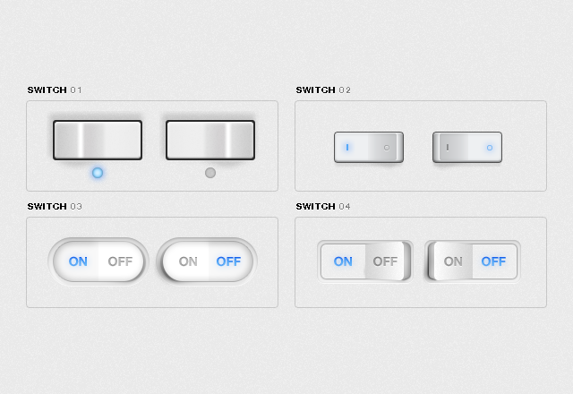
To really be able to customize the look of a UI it would be a nice addition to have Image Skinning for each button state, with options for stretch to fit, crop and scale.
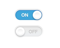
States:
Pressed
UnPressed
Toggled
Hovered
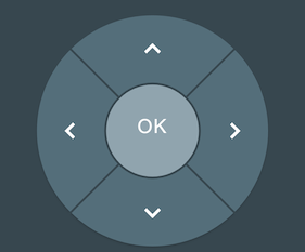
It would also be cool to allow for even more customized buttons shapes like those in a D-Pad where the buttons are something other than rectangle but I’m not sure what the best implementation for that would be. Maybe by allowing a skins alpha transparency to dictate which parts of the button are press-able?
No, it’s the same thing. I was looking for that previous feature request but wasn’t able to find it, I thought maybe I was wrong and had only imagined it, so I sent it in again.
However would it be possible to add the feature of “allowing a skins alpha transparency to dictate which parts of the button are press-able?” as I think this is an important feature that wasn’t part of the initial FR.