…maybe it can be based on some kind of similar segments, so later, you can make other parts of design look similar more easily…also like a swastika!
A question, when could you imagine changing the logo ? Vuo 1.3 already or later ?
Our plan is to coincide with Vuo 1.3. It’s going to be a huge release (as you might guess from the feature requests page), so it’ll be a while. Plenty of time to design a logo.
Let’s say this, if the Team wants a Mascotte, because they like it, sounds good.
If it is to metaphor how Vuo works, not so sure how much it will help people to know how it works.
I was 99% joking about the mascot :) You bring up good points about why an animal might not be the best logo for Vuo. Also an animal might mean different things to different people, like an octopus could seem intelligent to one person and scary to another.
sorry to ask but would it be possible to refer to the logos with links (sat some unique names for them all) instead of images / cropped reuploaded images ?
Sure. I edited my post to refer to your images by name+link.
Food for thought: Here are some logos of related software.

 (VDMX)



 (Max)
(Max)

 (TouchDesigner)

 (Origami)
 (Form)

 (Processing)
PureData:
personally I believe it is no shame to borrow parts of well known brands…it doesn’t mean to steal…
I mean, to inspire ourself yes, but I don’t think there should be a very obvious similarity though. I guess the Vuo team doesn’t want to take any risk that could lead to any copyright violation process at all.
They are also working in hand with teams like Coge and VDMX and I guess it shouldn’t alter their relations.
I have for example crafted another logo I might want to upload but I wonder if it’s not too VDMX like. Hesitating.
If I do upload it I could imagine I or the team asking the VDMX team if they don’t see any problem.
Christian’s ideas and also it somehow reminds me a Vaio brand, its idea is based on moving from analogue to digital
Damn yeah, love the Vaio logo. So fluid ;)
similar segments
Like your similar segments logo too ;) But don’t you think it’s quite close to the Origami icons ? Or too close to FramerJS ?
Our plan is to coincide with Vuo 1.3. It’s going to be a huge release (as you might guess from the feature requests page), so it’ll be a while. Plenty of time to design a logo.
Ok ;)
Food for thought: Here are some logos of related software.
Know your ennemies ;) Have been doing those researches too personally.
This is a mix of icons and logos though it seems. Some don’t really have a logo per se but use an icon for both use (Origami, Quartz Composer, Max …)
Or derivate is the logo of the company (which I love), I don’t really understand what their logo for Touch Designer is, if it’s the icon too.
Anyway.
My personal selection from those, those I like most are :
a - Logos : VDMX & Derivate.
b - Icons : Origami (studio, the new tool, on the right side) and Quartz Composer.
Here are some additionally more or less related softwares Icons & Logos (VJ & realtime apps, node based apps, art/code apps, mapping apps, prototype design apps):
2VP
Cinder

Flinto
Flowhub

FramerJS
Noam
Madmapper
Mixemergency
Nodebox

NoFlo
OpenFrameworks
Origami Studio Icon
Smode
NoFlo & FloHub do really have some sexy nodes / cables ! But that’s more likely to fit the other discussion Vuo Redesign - Nodes & Cables
@krezrock ;) Why not. Logo ? icon ? Both ? Not my preferred, it takes quite a lot of space. But that’s just my personal opinion. Thanks for your idea !
just a quick note…I don’t think vaio or eizo will stop by and sue you just by using some…concept of graphic design :D not shure if somebody own the right for using squares or round shapes :D that is what i meant…and believe me, in past ten years working for multiple advertising agencies (McCann, Y&R, Wunderman) and design studios, I have saw a lot of branding and nobody who would like to make a real problems…I guess important thing now is that “character” of brand i ve mentioned before…that is what makes a brand, not some specific shape or colour…and of course that could be a reason for some lawsuit at max, well, if you would basically just steal it…otherwise…if the character or “personality” is clear it is quite hard to not notice the difference between products…well…in theory…but you are doing this for quite smart people anyway…
Hey. I just want to say some things I like about your logo designs, in hopes that it will help with the next iteration.
@Bodysoulspirit’s
,
, and
— I like the simplicity of these. How they use a small set of elements (e.g. the U and O both have circular bases).
@Bodysoulspirit’s
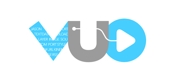
— I like that this coordinates with the design of the Vuo language. (It goes so far as to literally use a cable and ports.)
@Bodysoulspirit’s
,
,
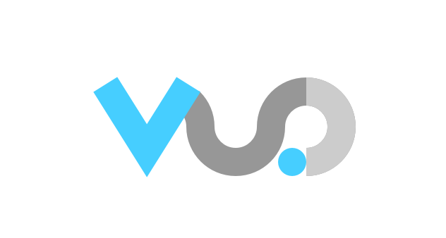
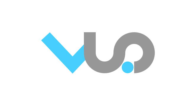
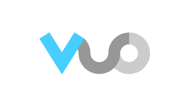
— I like how the combined U and O eliminate redundant parts (the U right side and O left side) and give a sense of flow (vuo). I like how the dot is reminiscent of a port.
@Bodysoulspirit’s
,
,
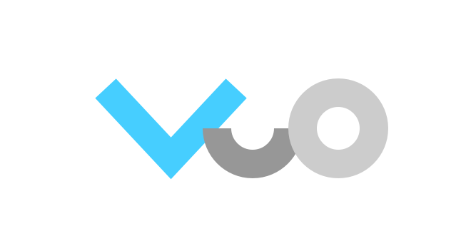
— I like how the partial U, especially with the partial O stacked on it, gives a sense of building blocks.
@DDAANNYYBBOOYY’s
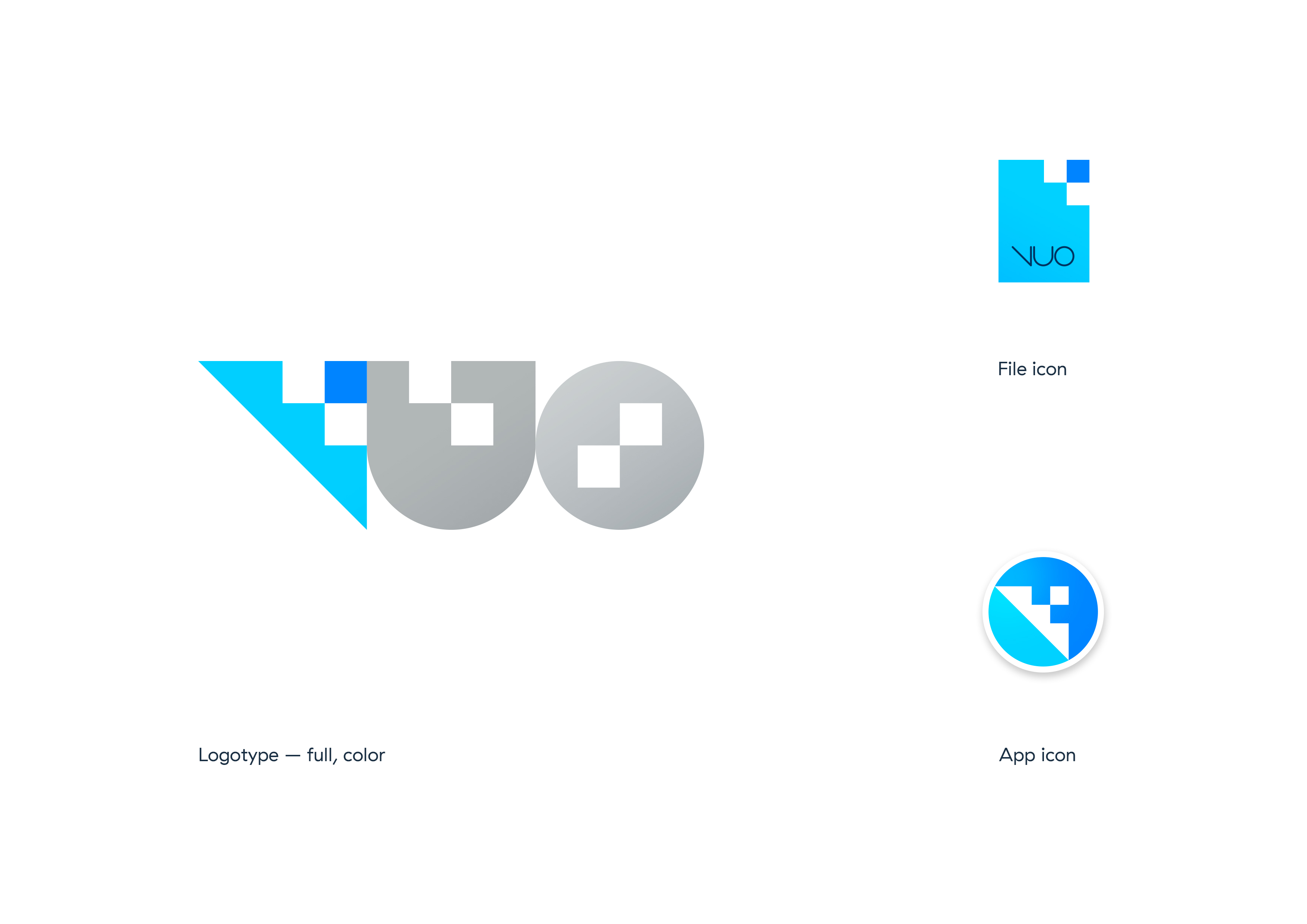
— I like that this logo has a distinctive shape that would be recognizable in black and white. I like the ideas behind it, kind of simultaneously zooming in and building up.
@Bodysoulspirit’s
— I like how the thin type and the bubbles set this logo apart from the many other “V” logos out there. And it looks nice on a coffee cup ;)
@krezrock’s

— I like the unusual perspective, how it’s looking down on the V from above.
I don’t think vaio or eizo will stop by and sue you just by using some…concept of graphic design
No I don’t think Vaio cares neither ;)
Hey. I just want to say some things I like about your logo designs, in hopes that it will help with the next iteration.
Just got an idea, let’s stack all the logos from the Team, from Danyboy, Azy and I on top of each other and we should get the perfect logo ;)
Kidding ! Thanks for the feedback @jstrecker and for your submissions guys !
In addition to ideas around the word “Vuo” and letter “V”, another possibility would be a picture with the word “Vuo” next to it for the logo, and just the picture for the icon.
Here are a few sketches to get that discussion started…
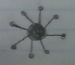
— Vuo as a hub for various devices, protocols, inputs and outputs.
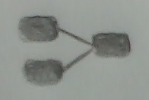
— A simplified rendering of 3 nodes connected by cables. (Is this too similar to the share icon?)
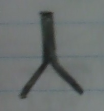
— An abstraction of the previous sketch: two streams merging (flow).
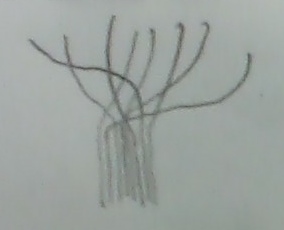
— More streams merging. They start out chaotic and become organized (flow, hub).
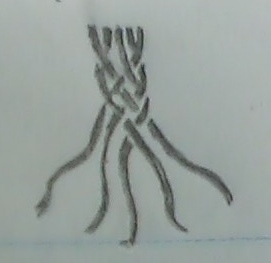
— Streams merging and becoming woven together (flow, hub, creation).
In addition to ideas around the word “Vuo” and letter “V”, another possibility would be a picture with the word “Vuo” next to it for the logo, and just the picture for the icon.
Here are a few sketches to get that discussion started…
Attempt to mold the Vuo text with some hub-like thing.
Has a molecular feeling, doesn’t bother me. Personally haven’t been able to make something closer to the last Team sketches and be nice tough (with my skills).
First tests with the team’s HUB sketch.
Just not so sure how much such a hub logo would not be too close to Touch Designer logo ?
I could want to play a bit with the colors more (like in the first mockups, blue V, grays for U and O but what about the idea ?
Been working to implement the hub with more colors.
The hub Inside the O is version (A) and outside the O is version (B) (+ Icon).
Version outside (B) may look better IMO but may be harder to use (website etc) because the Hub is bigger then the text.
C project was just a test for fun, some flow on top of a more rigid typography. Not as good as the hub stuff though.
Like those neon background gaussian colors.
All logos comes both on a White background and Black background.
Ooh, those are neat :) Discussing all the ideas so far with the team.
Btw, I just learned about ogees! Not sure if/how an ogee pattern might fit into a logo, but just putting it out there as something that looks flowy.
I just wanted to voice some support for the current logo! I like it.
Ooh, those are neat :) Discussing all the ideas so far with the team.
Glad you like my one full night work result ! ;)
Jaime, I also really like your logo 10 idea. Kind of reminds me of the way that classy audio companies like Telefunken and Neumann (among others) would have their logos fit in the outline of a diamond.
I like some of the pixellated looking ideas by Body Soul Spirit, and the “VUOLOGO-cropped.jpg” posted by Jaime.
20160721-A1 and Alex are interesting, and make me wonder how it would work with a squared off U and O, with each letter the same color…put together in a way that makes them a big continuous block, all letters connected.
I think the strongest logo of the stuff that’s been posted from related coding tools, is the OF logo. Maybe Cinder next.
:-)
Thank you, thank you, thank you to those of you who’ve submitted logo designs and provided feedback!
Ready for another round? :)
Team Vuo discussed the designs made so far. There are many things we like about them, but no single design yet that meets all of our criteria.
Please don’t feel like you have to throw away everything you’ve done so far! We’d be interested to see variations on the designs already posted, as well as brand new designs.
It’s awesome to see the logo design process being community-driven :)
I’ll reiterate the criteria that I mentioned before, plus some ideas that have come up since then.
We’re looking for a wordmark or combination mark. That is, stylized text or text plus a symbol.
Along with the logo, we’ll need an app icon. The icon and logo should coordinate.
The logo should represent Vuo — what it means to you and the rest of the Vuo community. “Each logo should communicate something” [1]. “More than anything, know what your logo means. Every logo has some kind of a history, filled with meaning and purpose” [2]. “A good logo is distinctive, appropriate, practical, graphic, simple in form and conveys an intended message” [3].
Most likely, that message will be conveyed by some kind of symbolism. “Secondary design considerations — color combinations, stylistic textures or typographical applications — might need updating over time, but if the logo is symbolic at its essence, secondary revisions can be made to the logo without negatively affecting the brand” [4].
The logo and icon should be distinctive. They should not look too similar to other brands, especially other apps. They should communicate what is unique about Vuo.
The logo should be simple and memorable.
The logo should look up-to-date. It should harmonize with the visual language redesign.
We’re looking for a logo where the “u” and “o” are lowercase. Lowercase letters, I think, are a better fit for our brand. And we’d like people to understand that the product name is a word (“Vuo”) rather than an acronym (“VUO”).
The logo should look good on different background colors: black or white.
Not to pick on anyone’s designs, but to illustrate the criteria, I’ll point out issues with some of the designs submitted so far.

— The logo doesn’t convey a message about Vuo. Also it’s all-caps.

— There’s symbolism (the “share” icon), but it conveys a message other than what Vuo is fundamentally about. (Maybe more appropriate for a social media app?) Also, it’s hard to see on a white background.
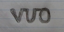
— The connected-letters motif is not distinctive. It’s already used by NoFlo, Noam, and VDMX.

— The logo isn’t simple. The text inside the “V” is noisy and wouldn’t be legible at smaller sizes.

— Though simpler than the previous logo, this one has enough complexity to detract from its being memorable, IMO.
Again, please don’t feel like you have to start over from scratch!
Developing a logo for Vuo is a big challenge. Vuo does so much that it’s difficult to concisely describe (verbally or visually). With so many of the Vuo community being savvy in design, it’s especially important for the logo to elegantly combine function (conveying a message) and form.
would you have some more details regarding what doesn’t’ fit the criterias for the last series ? Beside the fact of course that they are all caps ;)

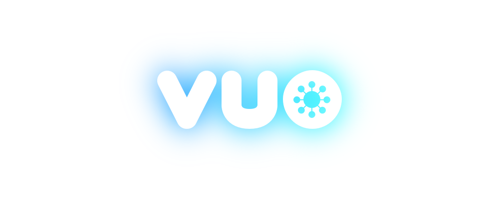

Thanks
