Congratulations Team Vuo on this exciting release, I’m having fun discovering new features.
The UI looks fresh. I love the new cable routing, it going to make for tidy patches and easier reading.
One thing i miss is the stroke on nodes in the editor UI. I feel like it helped distinguish whats what, especially when cables and nodes overlap.
Tiny thing i know, but the first thing i noticed.
Thanks_ Howie
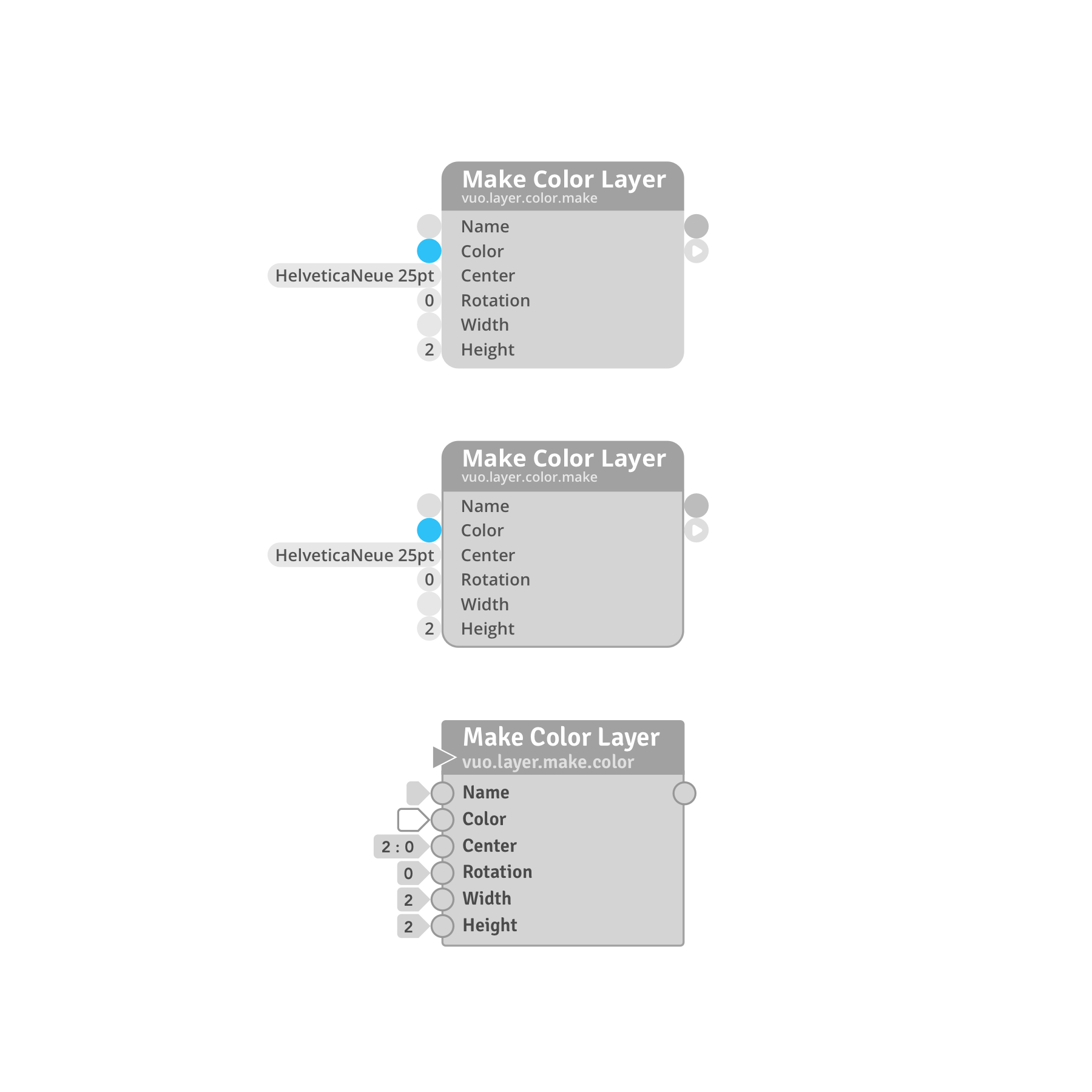
Hey @howie ;) great to have your thought. As someone who made some mockups for the new design, I wanted to say this : It’s always hard to find the right balance between beauty & functionality. For me, the stroke removal, is a big part of why the UI looks “fresher” (to use your terms ;), see image below comparing the new nodes, the new nodes with stroke, and the older nodes).
I also think most of the Vuo users I see on the website usually tend to arrange their nodes on a grid, rather than overlapping them.
I love the Vuo 2.0 UI, and think following cables & paths is much easier too. However, in some cases I agree with you, it’s harder to follow a cable for example, but I would not put that on the node stroke, for me it’s harder to follow some going-backward cables sometimes. The old cables followed huge curved paths, where the new ones constrained angular ones and sometimes they perfectly overlap some other elements now.
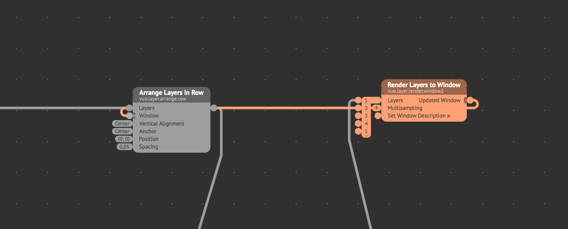
For example below, the “Updated Window” cable going back to the “Window” port overlaps the layer cable going from left to right, into the port 2 of the “Render Layers to Window”.
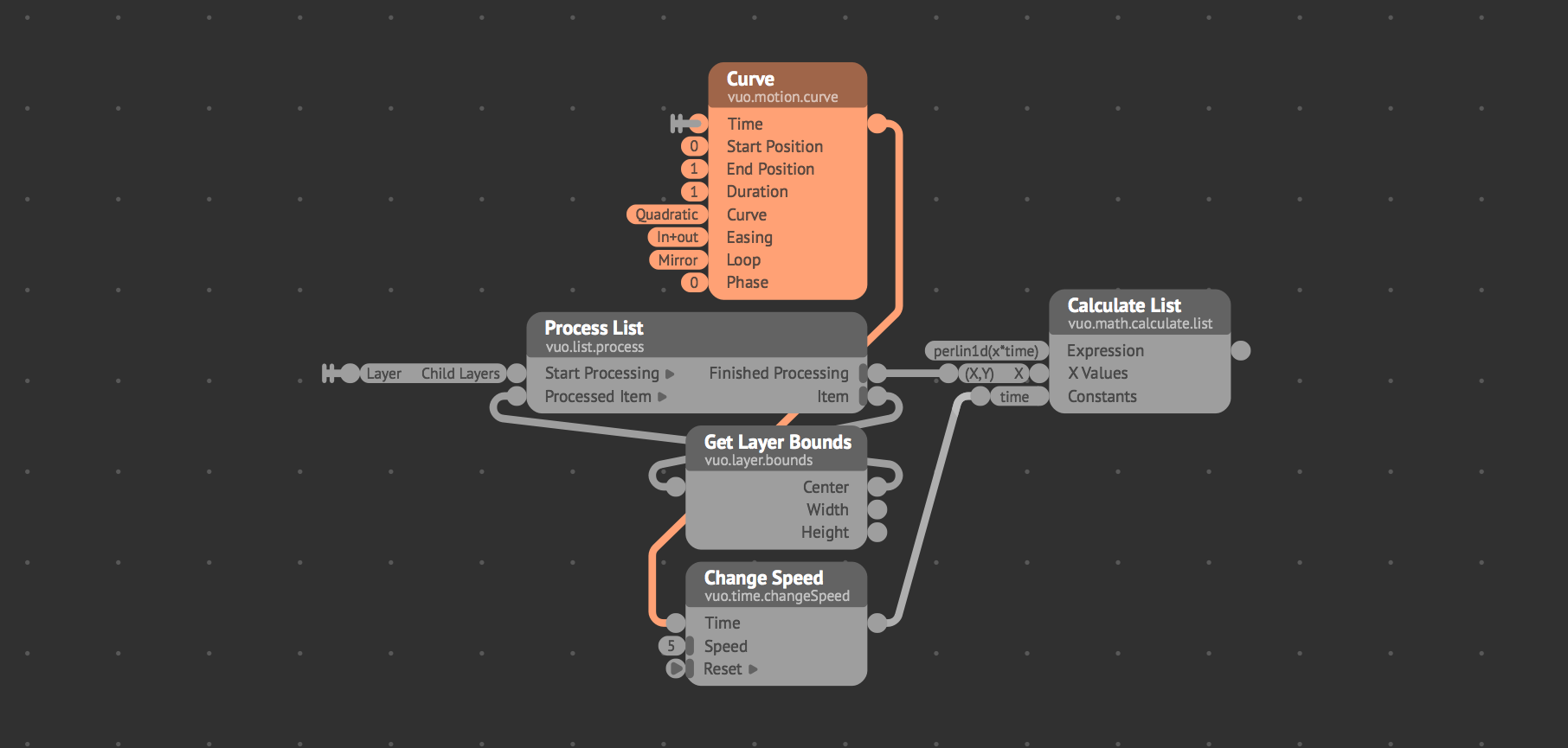
I don’t think putting strokes back to the nodes would change this a lot (furthermore strokes would merge with the new port doors). For example here below, you can perfectly follow the tangerine/orange cable path, without strokes. Node strokes here, in my opinion, would add visual information, making it harder to follow :
I guess, maybe we could think of improvements to suggest regarding cable coloring, and cable paths. I love the new paths, but maybe for cables going back, what should happen ? Should selected cables be on top / overlap non-selected nodes ? Should the path be a little bit offset lower so they don’t overlap other straight cables ? Should cables be draggable to adjust their position / path (like select-drag a cable to move its main middle portion), should selected node highlight only downstream cables as an option, or only upstream ? Should the cables color the ports of the downstream nodes according to their color (which would result in some traffic lights feeling on nodes ;)) ? Should we be able to select more node tints ?
A lot to think about ;) Anyway, if you think a node stroke would solve your problems, why not suggest a feature request ? I think options is the key to make everybody happy ;) One wants a cleaner UI? No stroke. One needs strokes ? Option to activate strokes ;)
Cheers